SenScore - Visual Match Analytics
....visualization is loading, please wait....
| the comprehension of Big Data Visual Analytics | Big Data meets our daily life in various ways. It comprises the handling of mass data, e.g. generated by people due to their social interaction in Web 2.0 platforms or industry applications that monitor statistics critical values of information. Although these are just two of many examples where mass data occur, their common potential lies in the capability of using these information the context of the semantic web, gathering knowledge about structured as well as unstructured data from various sources. Beside key words like "Hadoop" that focus on scalable and rapid data processing, handling the output of such systems builds the key link to the system's users. That's why, this demo site is used to demonstrate advanced possibilities of visual data analytics. The visualizations are built on data provided by Fraunhofer IIS who, recorded position, speed and acceleration values from sensors attached to players shoes, the ball and goalies' gloves during a 60 minutes soccer match. That data collection resulted in nearly 50 Million datasets with 13 characteristics and some hand-made statistics (e.g. ball possession duration). Combining these data sources, one is able to gather wisdom about the match progress and identify facts about goal scoring strategies and pass performance, just to mention three information that can be derived from this huge amount of data. Feel free to get in touch with the demo now Below you find some information about the diagrams (click the colored key words for navigation help). |
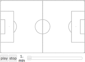 |
discovery of match statistics: Using heat maps is a smart way of visualizing the frequency scale of watched objects. Depending on ball losses and goal shots, one of four balls was dynamically used in this match. After data preprocessing, that evaluates which ball is the actual match ball you can now simply use the slider to build time-dependent information context about which parts of the pitch are covered most by the ball over the time to get information about where the match actually took place. During the elapsing time, the goal statistics tables are filled dynamically. By clicking on one of the rows, a graph diagram is displayed. Here, you can individually visualize the way a goal resulted from. Additionally you can also see the players involved to gather information about your key players. |
 |
exploring the pass quota: Each pass in this arc diagram is visualized by a quadratic function that gives information about the pass length by its width and the pass height by its angular point. To reach this, simply click on the button for the player to be analyzed and get insight on the passes played. Furthermore, these changes in ball possession are colored differently to divide good passes (green) from bad passes (orange). Analyzing the pass quota of the single players can result in wisdom about which player definitely need extra training hours in long or short passes. Comparing two or more players with each other is possible through arc highlighting. Just select the players you want to analyze by checking the several buttons and hover your pointer of the player's ID to accentuate its passing information. |
|
|
|
||||||||||||||||
|
|
|
Stephan Weiser |
Content protected by Creative Commons License  |
data provided by: |